网页中的丝带效果在设计中扮演着多重角色,其作用可以归纳为以下几个方面:
1. 视觉吸引与装饰
2. 信息引导与层次划分
3. 风格塑造与氛围营造
4. 强调与突出
5. 用户体验提升
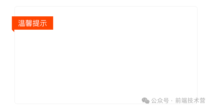
在开发中遇到丝带效果,你还在让UI给你切图吗?下面就介绍几种CSS实现网页中常见的丝带效果的实现方式。
基础布局如下:
<div class="box">
    <div class="ribbon">
        温馨提示
    </div>
</div>
.box {
    position: relative;
    width: 300px;
    height: 160px;
    margin: 60px;
    border-radius: 5px;
    background-color: #fff;
    z-index: 0;
    cursor: pointer;
    border: 1px solid #f6f6f6;
    transition: .5s;
}
1
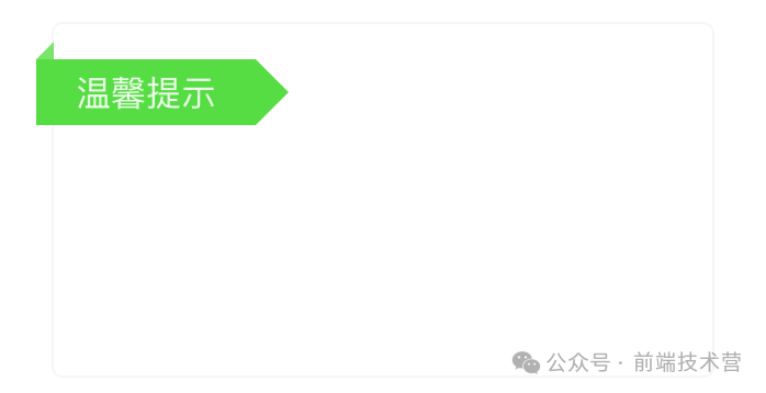
.ribbon {
    position: absolute;
    left: -8px;
    top: 16px;
    width: 100px;
    height: 30px;
    background-color: #57DD43;


    /* 内容居中 */
    display: flex;
    justify-content: center;
    align-items: center;


    &::before,
    &::after {
        content: "";
        position: absolute;
    }


    &::before {
        top: -8px;
        left: 0;
        height: 0;
        width: 0;
        border-bottom: 8px solid #57DD43;
        border-left: 8px solid transparent;
        opacity: .8;
    }


    &::after {
        right: -15px;
        height: 0;
        width: 0;
        border-top: 15px solid transparent;
        border-bottom: 15px solid transparent;
        border-left: 15px solid #57DD43;
    }
}
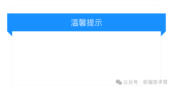
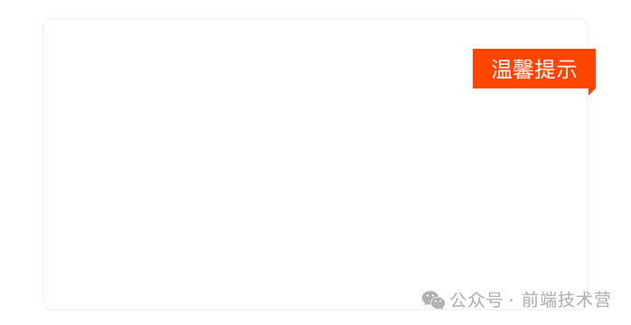
.ribbon {
position: absolute;
left: -10px;
top: 16px;
width: calc(100% + 20px);
height: 36px;
background-color: #1890ff;
/* 内容居中 */
display: flex;
justify-content: center;
align-items: center;
&::before, &::after {
content: '';
position: absolute;
}
&::before {
left: 0;
height: 0;
width: 0;
border-top: 10px solid #1890ff;
border-left: 10px solid transparent;
bottom: -10px;
}
&::after {
right: 0;
bottom: -10px;
height: 0;
width: 0;
border-top: 10px solid #1890ff;
border-right: 10px solid transparent;
}
}
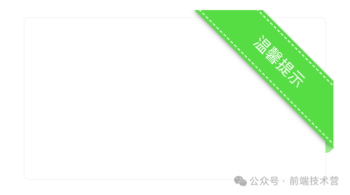
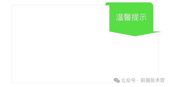
<div class="box">
    <div class="ribbon">
        <span>温馨提示</span>
    </div>
</div>
.ribbon {
    position: absolute;
    top: -8px;
    right: -8px;
    width: 150px;
    height: 150px;
    overflow: hidden;


    &::before, &::after {
      content: "";
      position: absolute;
    }


    &::before {
      left: 8px;
      width: 40px;
      height: 8px;
      border-radius: 8px 8px 0px 0px;
      background-color: var(--ribbon-primary-color);
      opacity: .6;
    }


    &::after {
      border-radius: 0px 8px 8px 0px;
      width: 8px;
      height: 40px;
      right: 0px;
      bottom: 8px;
      background-color: #57DD43;
      opacity: .6;
    }


    & > span {
      position: absolute;
      top: 20%;
      right: -40%;
      z-index: 2;
      width: 150%;
      height: 40px;
      overflow: hidden;
      transform: rotate(45deg);
      border: 1px dashed;
      box-shadow: 0 0 0 3px #57DD43, 0px 21px 5px -18px rgba(0, 0, 0, 0.6);
      background: #57DD43;


      /* 文本居中 */
      display: flex;
      justify-content: center;
      align-items: center;
      color: white;
    }
}
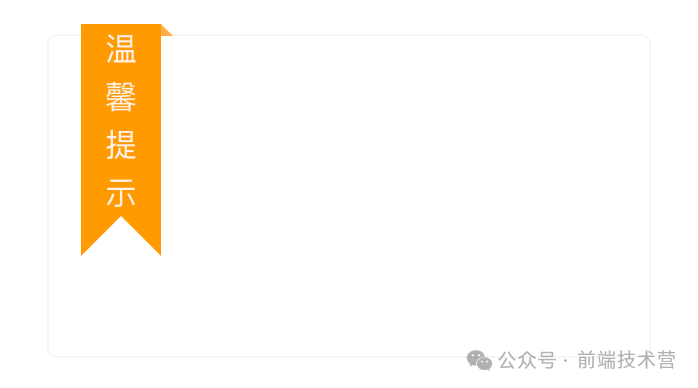
.ribbon {
    position: absolute;
    top: -6px;
    left: 16px;
    width: 40px;
    padding: 0 10px;
    box-sizing: border-box;
    text-align: center;
    background: #ff9900;


    &::before,
    &::after {
        content: '';
        position: absolute;
    }


    &::before {
        top: 0;
        right: -6px;
        height: 0;
        width: 0;
        border-bottom: 6px solid #ff9900;
        border-right: 6px solid transparent;
        opacity: .8;
    }


    &::after {
        height: 0;
        width: 0;
        left: 0;
        bottom: -20px;
        border-left: 20px solid #ff9900;
        border-right: 20px solid #ff9900;
        border-bottom: 20px solid transparent;
    }
}
.ribbon {
    position: absolute;
    top: 14px;
    left: -5px;
    padding: 2px 10px;
    background-color: orangered;

    color: #fff;


    &::before {
        content: "";
        position: absolute;
        left: 0;
        bottom: -4px;
        border-top: 4px solid orangered;
        border-left: 4px solid transparent;
    }
}
.ribbon {
    position: absolute;
    top: 10%;
    right: -5px;
    padding: 2px 10px;
    background-color: orangered;

    color: #fff;


    &::before {
        content: "";
        position: absolute;
        right: 0;
        bottom: -4px;
        border-top: 4px solid orangered;
        border-right: 4px solid transparent;
    }
}
<div class="box">
    <div class="ribbon">
        <span>温馨提示</span>
    </div>
</div>
.ribbon {
    position: absolute;
    top: -6px;
    right: 10px;


    &::after {
        content: "";
        display: block;
        position: absolute;
        width: 0;
        height: 0;
        border-left: 53px solid transparent;
        border-right: 53px solid transparent;
        border-top: 10px solid #57DD43;
    }


    &>span {
        position: relative;
        display: inline-block;
        width: 90px;
        height: 60px;
        line-height: 60px;
        text-align: center;
        background: #57DD43;
        border-top-right-radius: 8px;


        &::before,
        &::after {
            content: "";
            position: absolute;
        }


        &::before {
            left: -6px;
            top: 0;
            width: 6px;
            height: 6px;
            background: #57DD43;
        }


        &::after {
            left: -8px;
            top: 0;
            width: 8px;
            height: 6px;
            border-radius: 8px 8px 0 0;
            background: #57DD43;
        }
    }
}
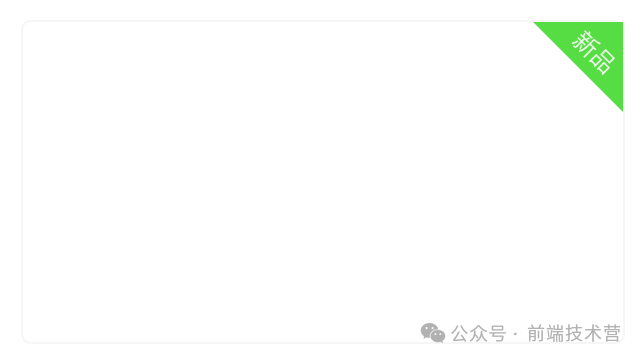
<div class="box">
<div class="ribbon">
<span>新品</span>
</div>
</div>
.ribbon {
    position: absolute;
    top: 0;
    right: 0;
    width: 45px;
    height: 45px;
    background: #57DD43;
    clip-path: polygon(0 0, 100% 100%, 100% 0);
    span {

        position: absolute;
        top: 6px;
        right: 2px;
        display: inline-block;
        transform: rotate(45deg)
    }
}
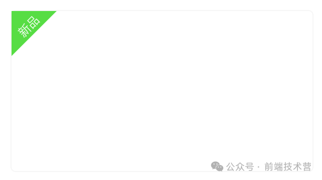
<div class="box">
    <div class="ribbon">
        <span>新品</span>
    </div>
</div>
.ribbon {
    position: absolute;
    top: 0;
    left: 0;
    width: 45px;
    height: 45px;
    background: #57DD43;
    clip-path: polygon(0 0, 0 100%, 100% 0);


    span {

        position: absolute;
        top: 6px;
        right: 16px;
        display: inline-block;
        transform: rotate(-45deg)
    }
}
网页中的丝带效果在视觉吸引、信息引导、风格塑造、强调与突出以及用户体验提升等方面都发挥着重要作用。设计师在运用丝带效果时,应根据网页的整体风格和设计需求进行灵活搭配和创新设计,以达到最佳的视觉效果和用户体验。
该文章在 2024/10/11 9:30:07 编辑过


 400 186 1886


